From 20-page pitch deck to Top 10 CEO priority project
Every growth experiment won on its own. Together they broke the app. The story of a self-initiated fix that became a top-10 CEO initiative.
- Instacart
- Company
- Design lead
- Role
- 2022–23
- Timeline
- Top 10
- CEO initiative
- 70+ people
- Core team

What started off as a simple pitch deck that I made to clean up the Instacart app helped catapult this project into the CEO’s top 10 priority list staffed with over 70 people working on it across orgs. It’s been estimated to save the company $700 million due to reduction in inefficient marketing spend.
This case study is about influence, perseverance, landing and creating a systems-oriented initiative, partnering closely with XFN like Product Directors and Eng Managers to make this project a reality.
Timeline of events
Change takes time. This was no regular, scheduled project. Rather I had to work through a rotating cast of folks but with each team we fanned the flames of this project to make the value prop apparent, the business impact clearer, and the engineering effort worth the cost.

Setting off a spark
I created a 20-page deck outlining the problem and potential solutions. Got the blessing from PM + Design Directors. Then partnered with a PM to build cross functional support across Instacart.

A sisyphean task
In July a team—new PM, Senior Eng Manager, Project Manager, me and a Content Designer formed to continue tackling this project.

The team comes together
Early in 2023, the team officially formed. While the former PM and Eng Manager leave I now get to work with 50+ people across various orgs on this initiative.

Top 10 CEO initiative
Later in 2023 this project rose to a top priority for the CEO and we had expanded funding to unlock new levers of growth.
Tragedy of the commons
Here’s how it all started. Our org heavily skewed towards designing for regular users overlooking new users. In isolation, every launched experiment, especially for existing users, was successful but taken together the experience amounted to lots of “broken windows”. There were challenges across multiple platforms but probably one of the worst offenders was the mobile web experience illustrated below.
1. Discover
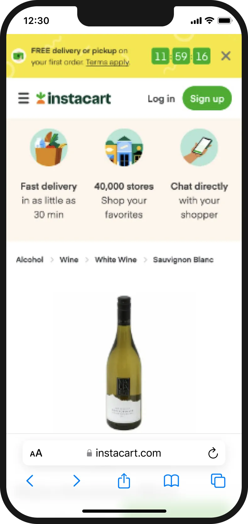
Product listing page props took up almost half the UI and pushed the call to action down.
2. Sign up
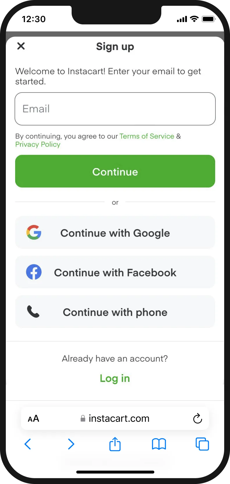
Early sign-up prevented customers from browsing available inventory.
3. Upsell
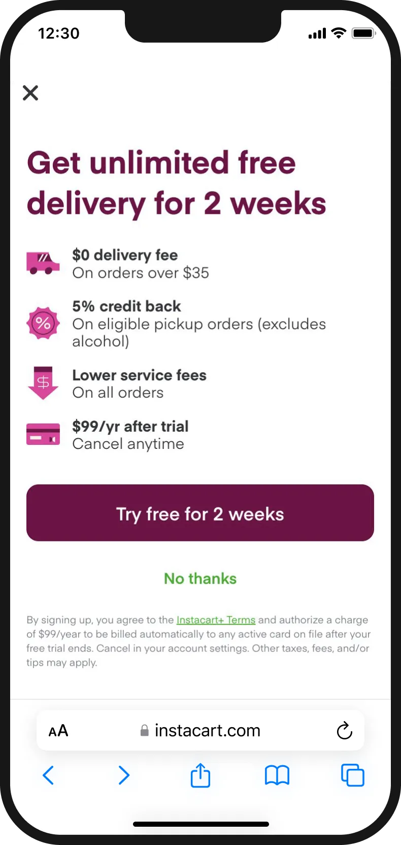
Before the customer could try the service they were hit with the membership upsell.
4. Add loyalty
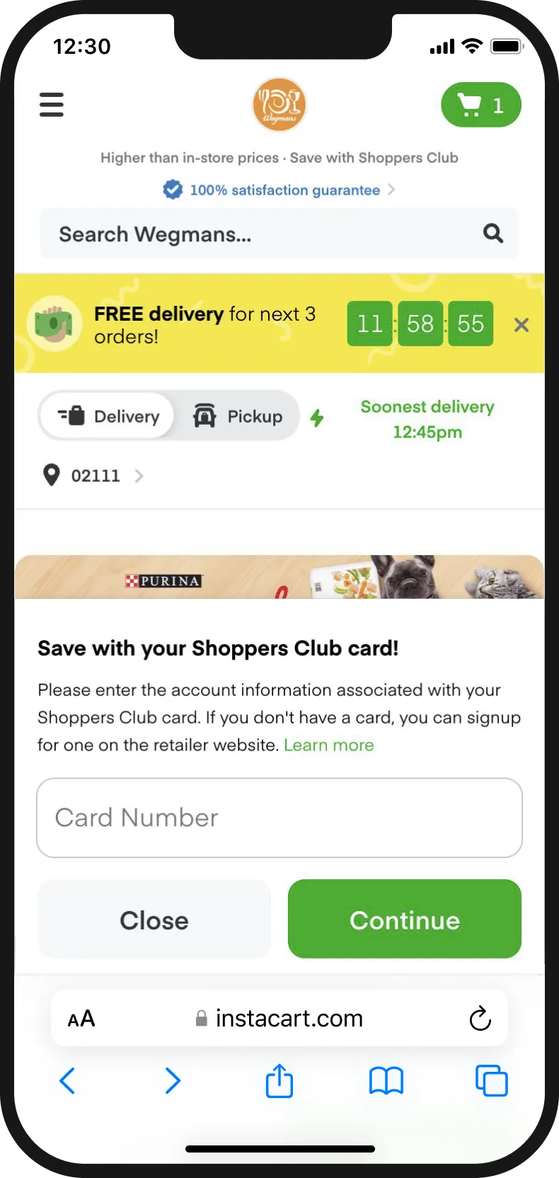
Loyalty cards and free delivery blocked shoppable UI.
5. More UI
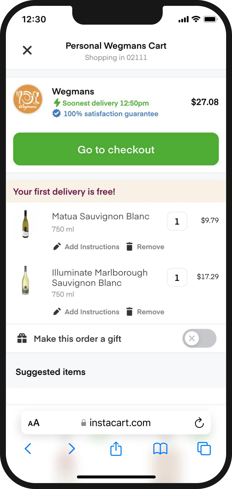
Gift orders and various guarantees scrunched space to review items.
6. And upsells
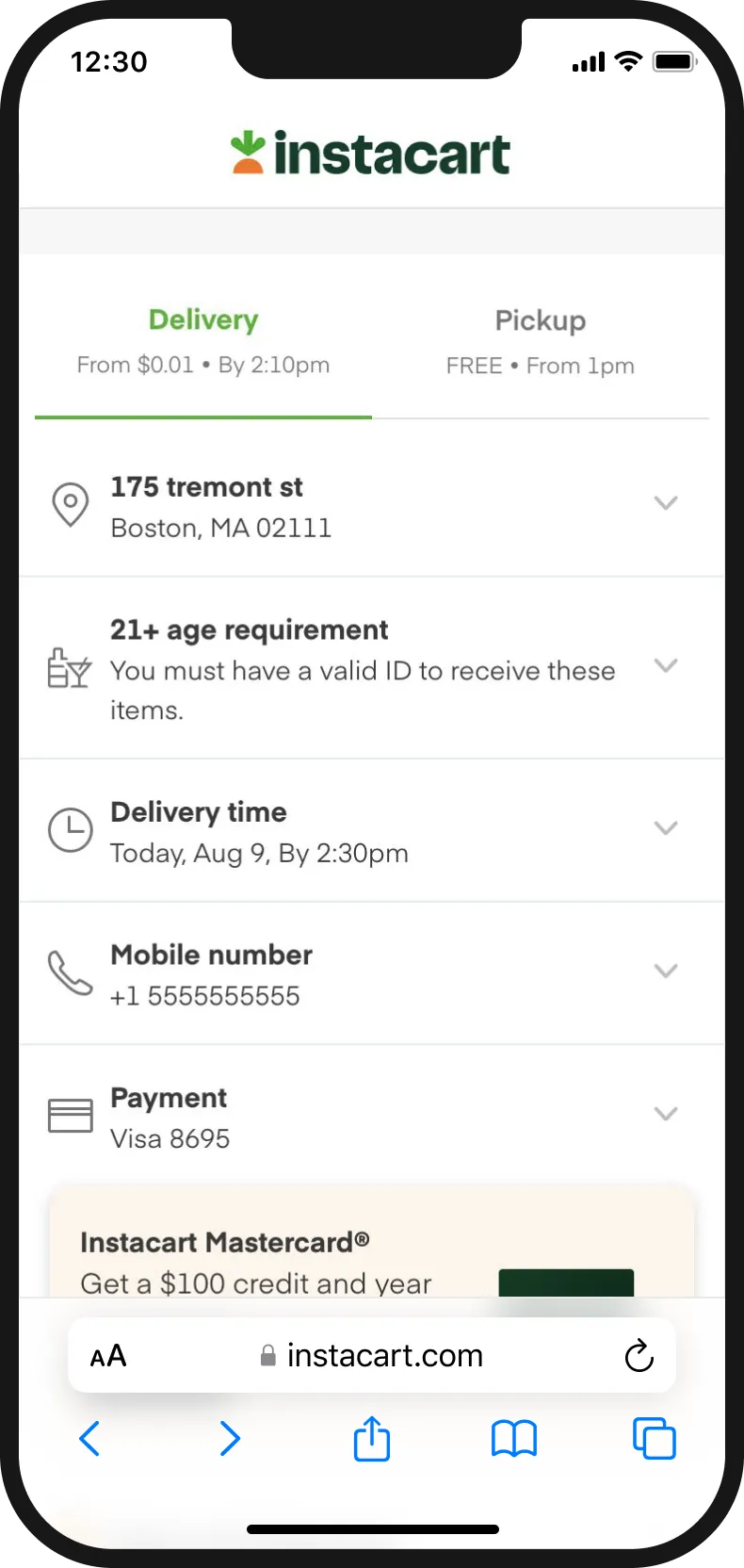
Upsells prevailed in checkout and some incentives no longer made sense.
From personas to lifecycle
Before diving into specific solutions, we had to step back and think about the ideal experience. It wasn’t just a matter of removing upsells and promos. Instead, we wanted to ensure that customers would see the right message at the right time. To that end, myself and a content designer started brainstorming personas and how we may tailor our messaging to them.
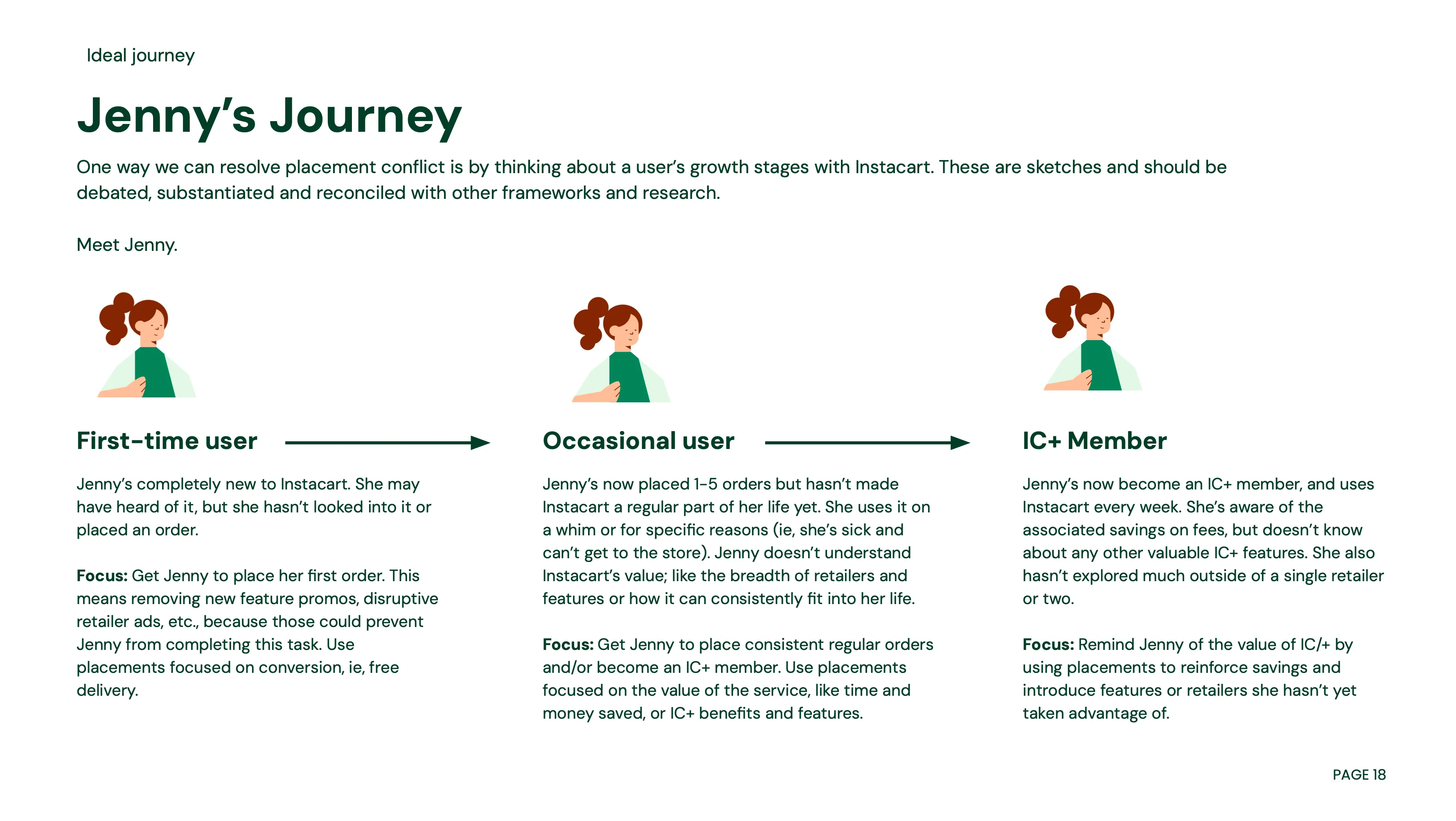
Our biggest revelation came from an insight that we should be showing the different messages based on the persona’s lifecycle. As a result we wrote down the story for Jenny and how her experience changes and matures based on her interaction with Instacart. This might sound common sense now but back then, we didn’t have the instrumentation, let alone the language to talk about this at the time. Prior to this framing, Instacart personas were heavily used by marketing but designing for them proved tricky.
But to make this reality we couldn’t rely on just these loose sketches of Jenny’s journey alone — we had to build a platform. My proposal was to build the following:
- Internal tooling—Make it easy to create placements and set appropriate guidelines and guardrails.
- System transparency—Tooling should give us transparency into what the user experience will ultimately look like.
- Clear metrics—Get accurate and insightful metrics on campaign performance, be it for ads or internal campaigns.
Sprinting for shared understanding
Fast forward to Jan 2023. Pitching leadership helped us ultimately win the funding and help us establish the Growth Platform team then. To formalize this effort I ran a cross functional sprint. This was a big undertaking—and the ask was to organize a brainstorm for 50 people and representatives to make this work and the last thing I wanted to do is get people to write a bunch of stickies for hours.
So instead, to get people thinking, I’ve organized a brainstorming workshop around 3 activities to keep things insightful and interesting while also coordinating with multiple designers and PMs to help facilitate the sessions, breaking up the group of 50 into about 8 sub groups. Things didn’t always go 100% to plan and there were a few challenges with scheduling but in the end we were able to make it work.
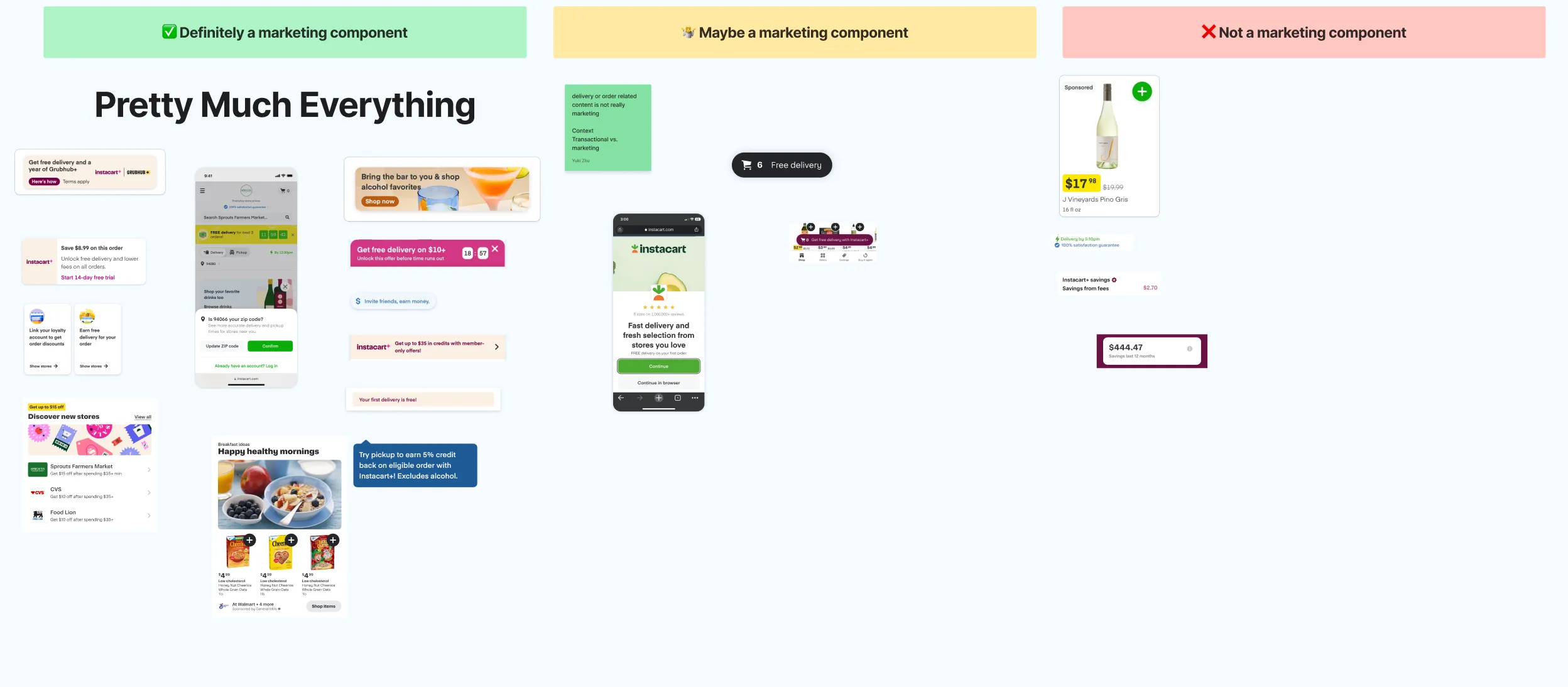
What’s in a marketing component—participants sorted and discussed what belongs in Growth Platform.
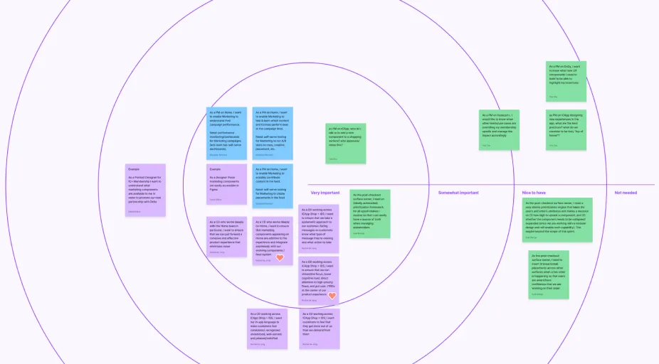
Your system wishlist—stakeholders prioritized the features most important to them.
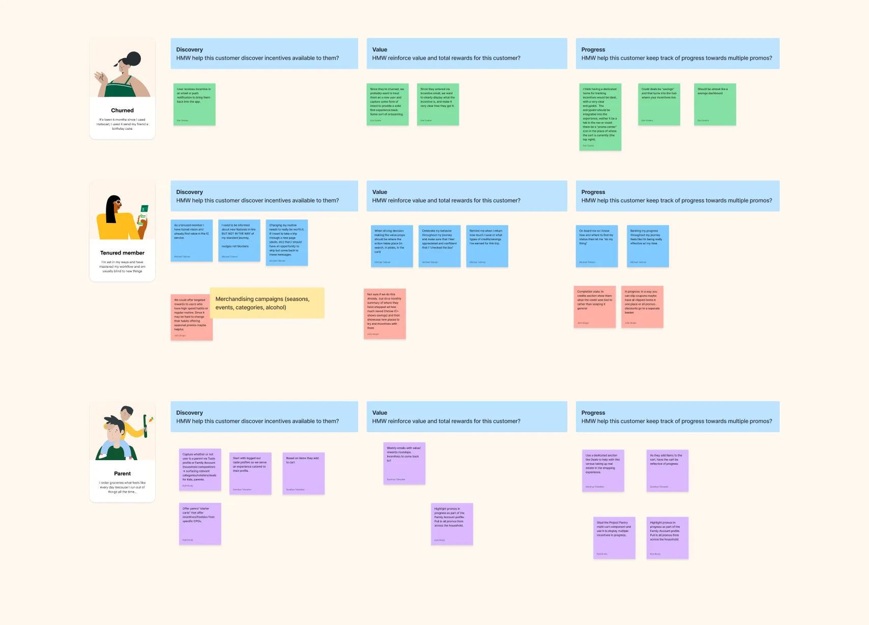
From a customer’s lens—we took one use case, incentives, and mapped it across the personas.
The brainstorms gave us a shared understanding of how to talk about “marketing components”, priorities for the roadmap and a rough sense of how their campaigns could show up for different users based on their experience with Instacart (new, returning, churned, deeply churned, etc.).
Developing vocal variety
The previous mandate of growth demanded smaller, louder placements above the fold. I flipped this notion: how might we develop vocal variety for placements instead?
Louder
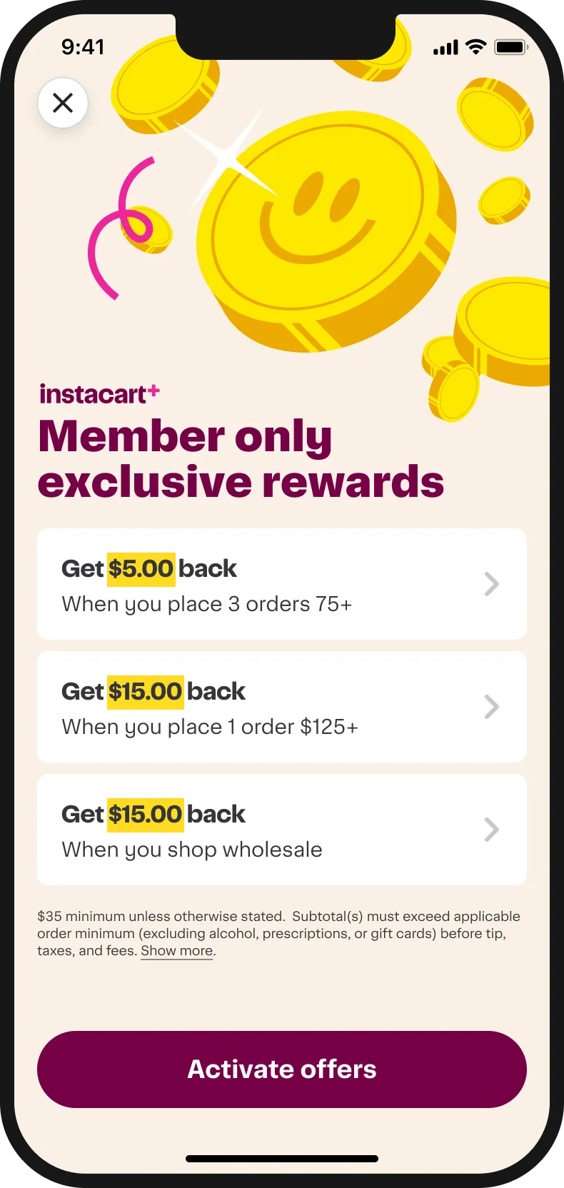
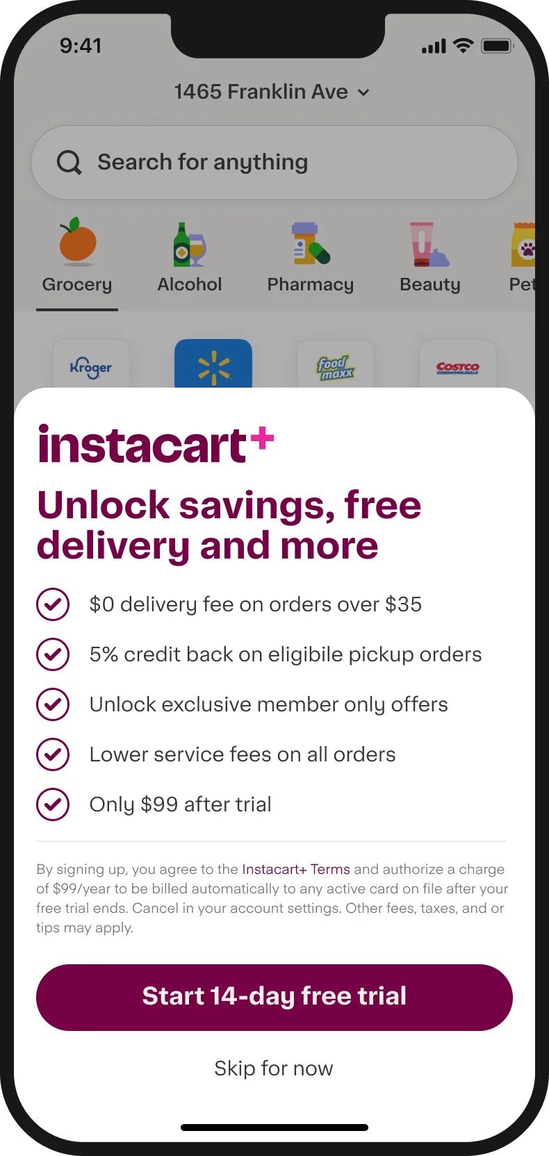
Full pages and sheets for highly valuable offers
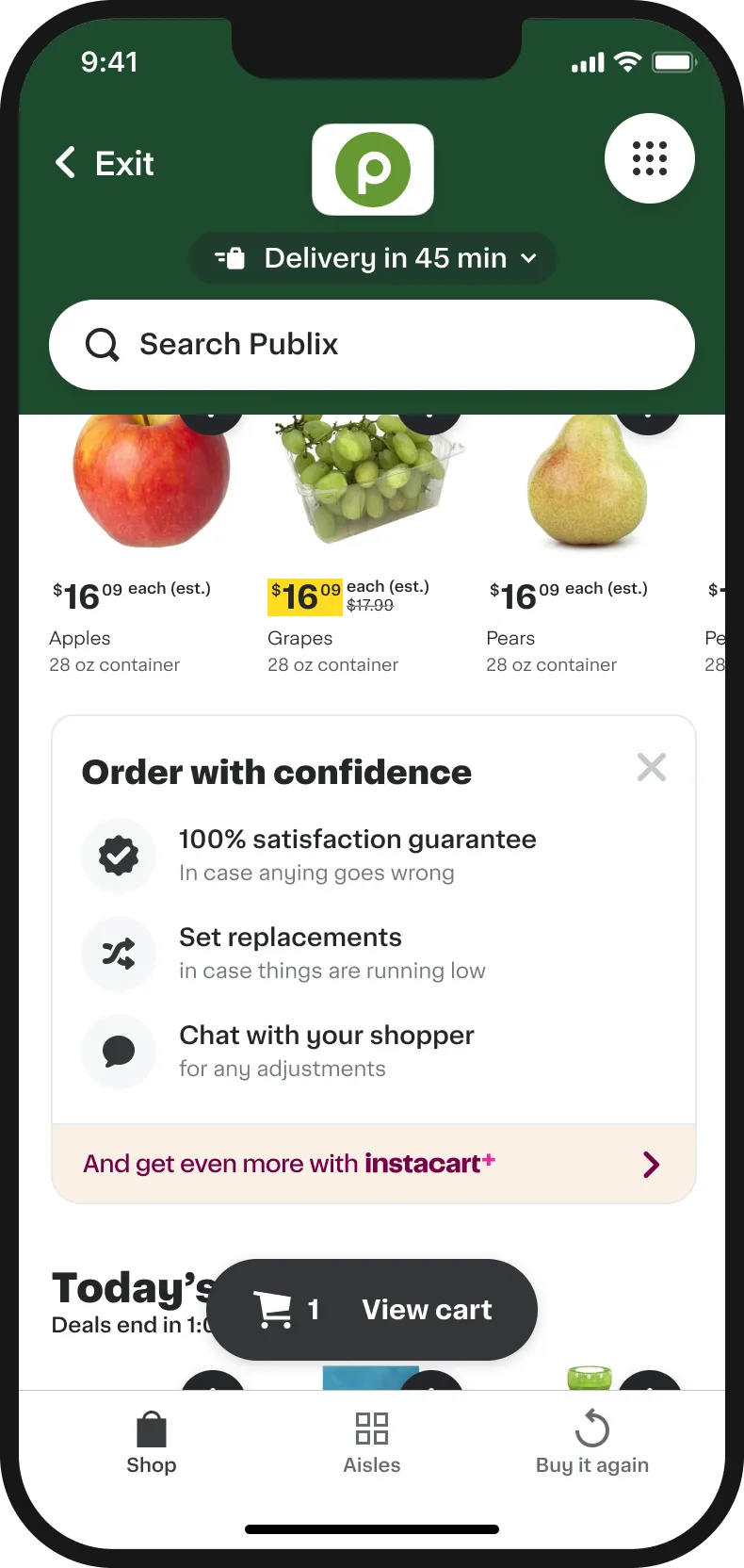
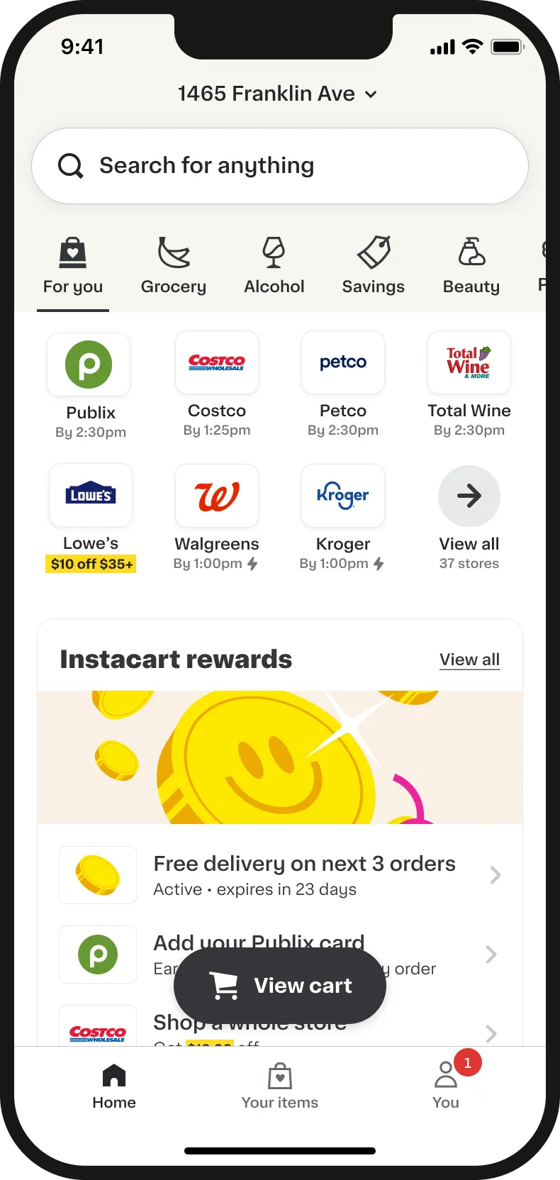
Richer in-line feed modules combining education and upsells
Softer
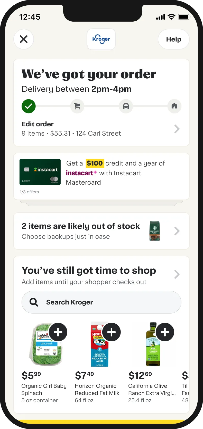
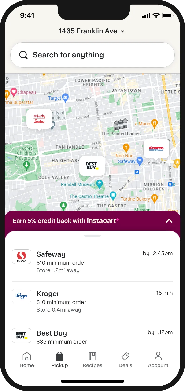
Embedded upsells and offers throughout the experience to avoid banner blindness
Helping customers build their basket
During the sprint we explored incentives and Instacart value props as a layer across the whole journey. This was in stark contrast to our current experience, which blocked a significant portion of the shoppable UI.
Incentives show up as a layer, embedded inline.
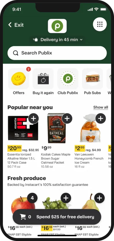
Floating cart doubles down as an incentive tracker.
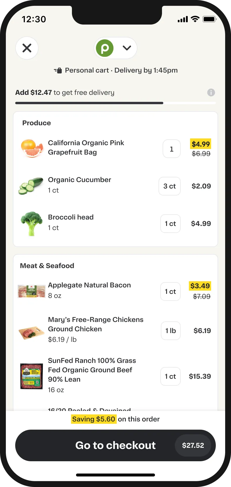
Cart page reinforces incentives progress.
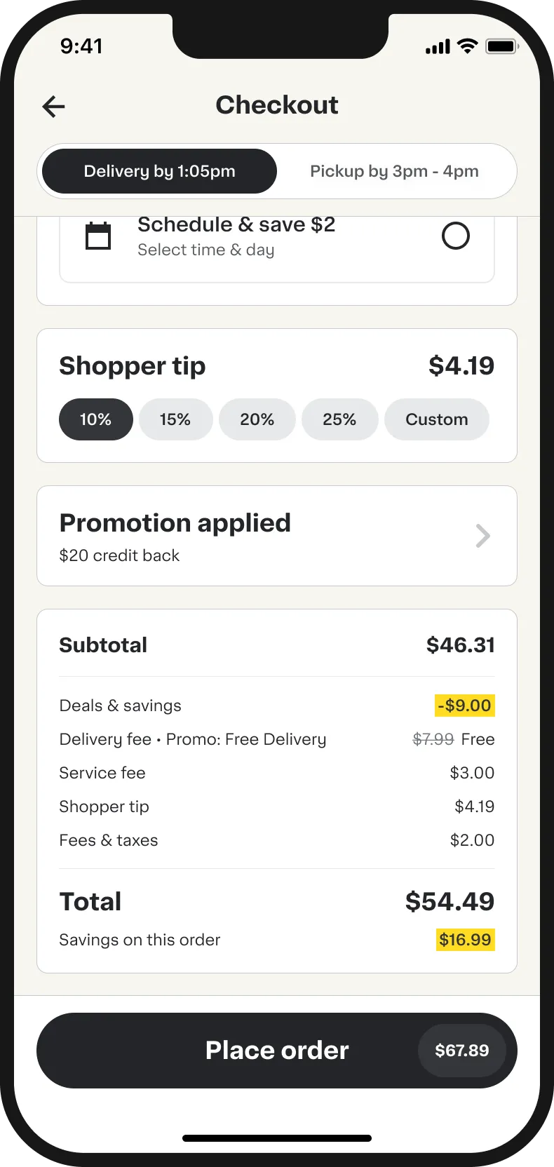
Checkout page spells out savings and promos.
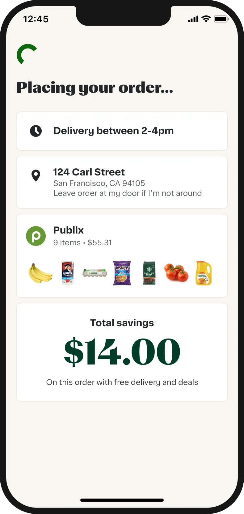
Savings are reinforced after an order has been placed.
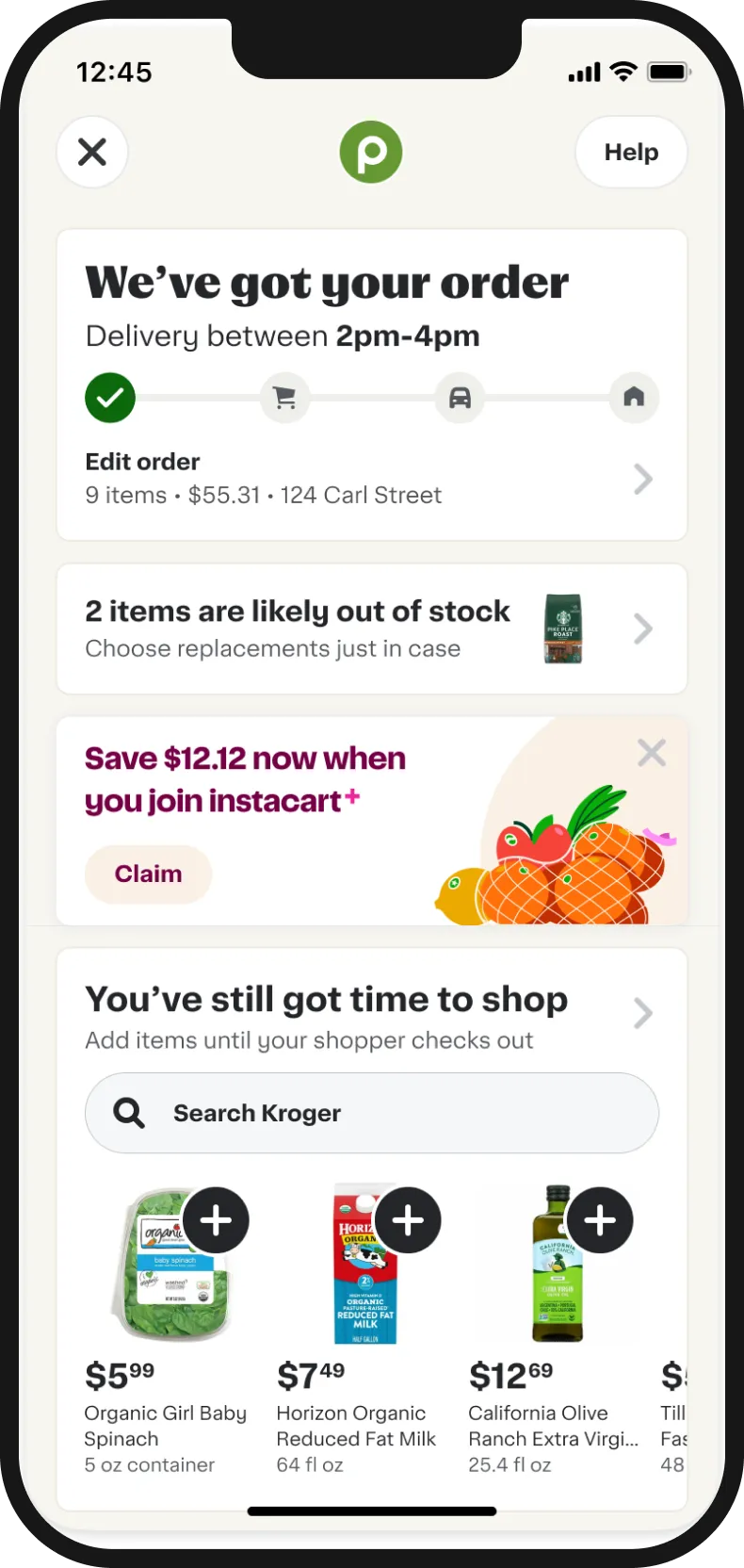
Relevant upsells help customers save even more.
From sprint to production
Focusing on incentives
Post sprint, I worked with the PM to align on which concepts to take forward. Incentives emerged as a major area to look into because of our high marketing spend.
Disconnected systems
Our systems could already support customer incentives: free deliveries, an Instacart+ free trial, $X off a $Y order. The problem was that none of them could talk to each other.
Disconnected interaction and design
We also lacked coherence in how discounts were shown. Customers saw offers in all kinds of visual treatments, which made it hard to understand what they needed to do to get one.
Connecting the dots
The concept below is one of many surfaces I tackled to build a system that nudges customers to complete incentives while celebrating their savings.
New ways of tracking incentives
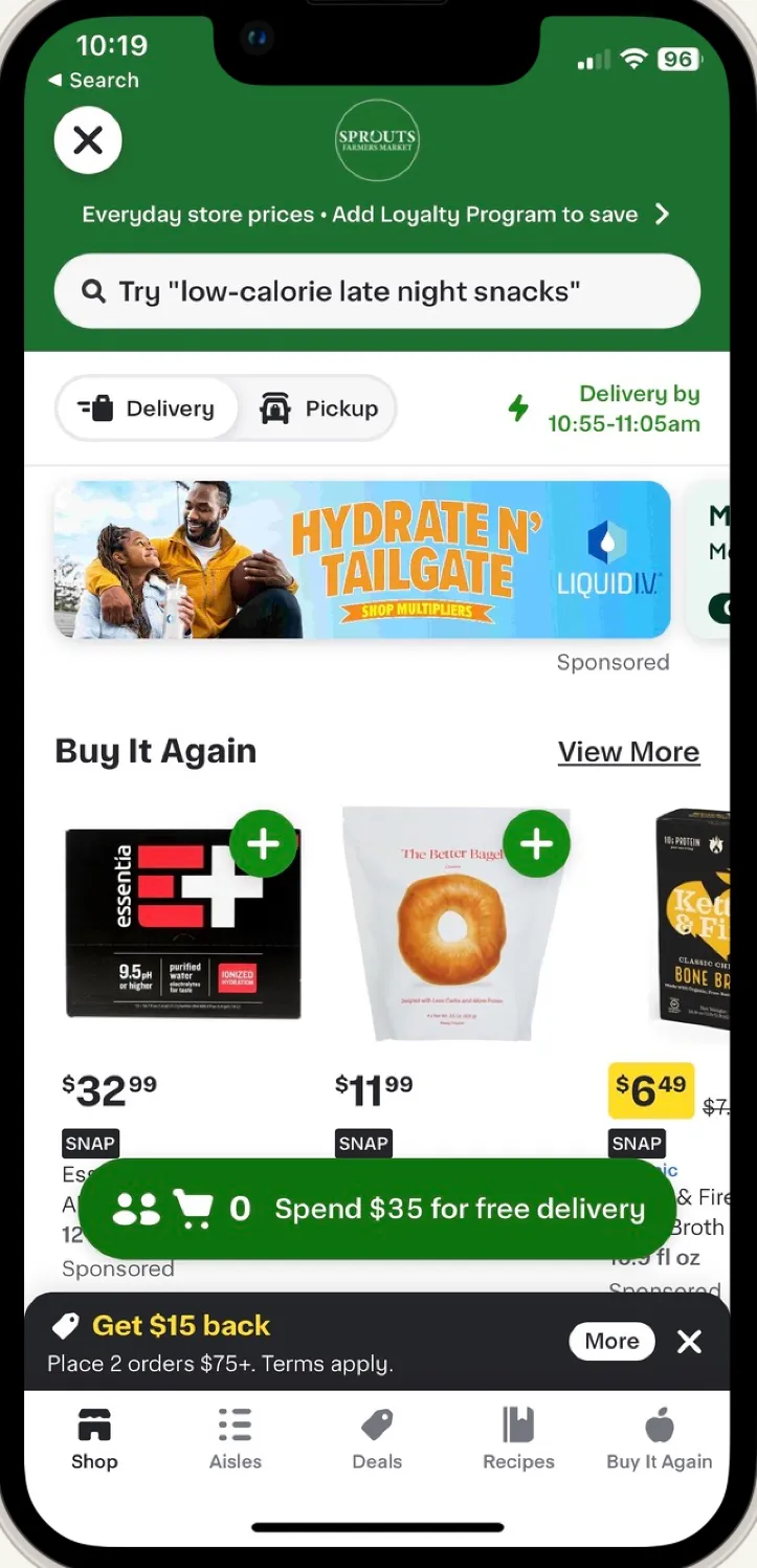
Previous state
Lessons learned
Eyes on the prize
Navigating this project was no walk in the park. I got strong feedback from multiple Product Directors, including “this sprint was too narrow in scope and the communication was lacking”. I followed up one on one to ease their concerns and to help us get out of the binary mentality: either we make money, or the design looks good.
Make do with stretched resources
When my PM was stretched, I leaned into planning, project management and execution to unblock my immediate design partners while giving engineering visibility.
Operate in light of conflicting guidance
Even on a larger project, people will be upset with some of the decisions made. Aligning people on principles and bringing them along from the onset makes for more productive conversations that move the entire company forward.